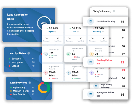
Enhanced Data Representation and Decision-Making
Chart view renders visual representations of data, helping businesses analyze trends, identify patterns, and make well-informed decisions. It further enhances data comprehension and fosters efficient decision-making and strategic planning processes.
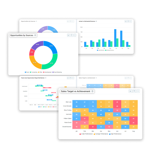
Key Benefits
- Enhanced Data Visualization: Chart view transforms complex data into intuitive visual representations. It enables users to grab the information quickly and effortlessly, leading to a better understanding and interpretation of key metrics & trends within the ERP system.
- Trend & Pattern: With chart view, businesses can conduct in-depth trend analysis and easily identify patterns within their data. This capability enables proactive decision-making based on historical performance & emerging trends.
- Improved Decision-Making: By presenting data visually, chart view facilitates clearer insights, aiding decision-makers in spotting opportunities. Furthermore, it helps in mitigating risks and optimizing strategies to drive enormous business growth and competitive advantage.
- Streamlined Strategic Planning: The chart view renders a comprehensive overview of relevant data, empowering organizations to formulate and refine strategic plans quite effectively. With a streamlined process, you can ensure alignment with organizational goals.
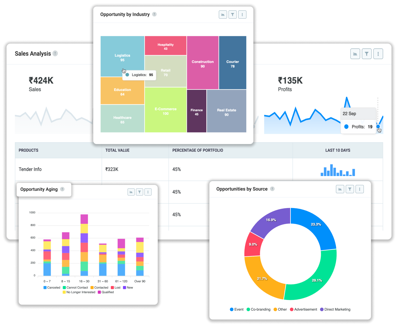
Key Benefits
- Bar chart: With chart view’s bar chart users can easily carry out item comparisons across groups which allows them to monitor value changes over time or track resource hours utilized in project management. It is as cool as it could get!
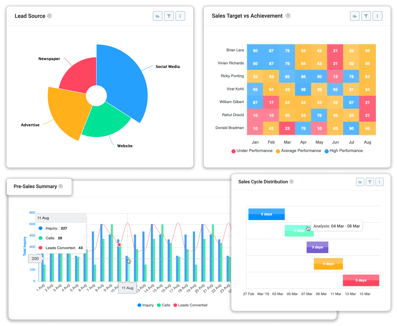
- Stacked bar chart: Opt for Stacked Bar Charts to compare various values across different groups. Each value comes color-coded for an easy peasy, rainbow-like comparison. Gone are the days when data wasn’t colorful.
- Compare data with column charts: Column charts allow meticulous comparison of items based on groupings that resonate with your specific needs. From analyzing sales performance across regions, tracking customer engagement by demographics, or monitoring project progress by team members- it is all easy!
- Classic stacked area chart: Effortlessly compare values over time with this perennial favorite. It is deal for essential comparisons such as Budget vs. Actual. Always in vogue and never out of style, it remains a staple in data visualization.